


February 2015
— measuring and comparing the competitiveness of the South African wheat industry with Australia
DIVAN VAN DER WESTHUIZEN and LINDSAY TRAPNELL, The Bureau for Food And Agricultural Policy (BFAP); Acknowledgement: ASHLEY HERBERT, Agrarian management, Perth
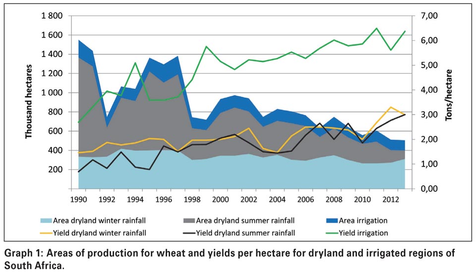
Concern has been shown about the persistent decline of areas sown to wheat in South Africa. In 1982, South Africa cultivated more than two million hectares of wheat and have ever since declined to 482 000 hectares in 2014 with the majority of the area lost in the summer rainfall region, or more specifically, the Eastern Free State (Graph 1).
A number of drivers have influenced this reduction over the past three decades where profitability, production risk and more favourable alternative crops were the main contributors.
Technology in maize and more recently, soybean seed varieties led to a steeper increase in yield levels which favour these summer crops above wheat production. Currently, the question is being asked whether climate change has influenced traditional precipitation during key growth stages of wheat in the Eastern Free State, forcing yield and yield growth trends downwards.
Furthermore, the adoption of conservation and rotational farm practise in the Western and Southern Cape, led to a consolidation of hectares between wheat, barley, canola and pasture crops.
Graph 1 illustrates the loss in area over the past two decades and in particular, the summer rainfall region. The graph further illustrates the yield trend for dryland and irrigated wheat.
In this article, a comparison is made between South African and Australian wheat industries in order to measure and bench mark the relative competitiveness of the South African wheat industry with a large global player such as Australia.
Industry overview: South Africa and Australia
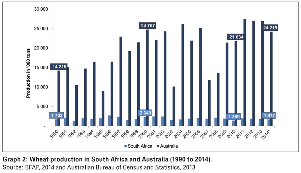
In the following graphs, comparisons are made between South Africa and Australia for total production, yield per hectare and US$ value per ton for the period from 1990 to 2014. It is projected that Australia will produce more than 24 million tons of wheat in 2014 under approximately 13,83 million hectares compared to 1,68 million tons of wheat in South Africa under 482 000 hectares (Graph 2). Area under wheat production has increased from 9 million hectares in 1990 to 13,83 million in 2014.
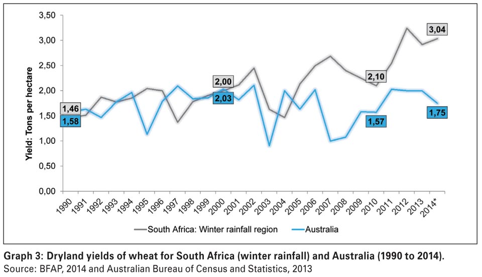
Graph 3 illustrates the dryland wheat yield trends from 1990 to 2014. As can be observed from the graph, South African (winter rainfall region) yield levels have tracked those of Australia until 2000. Towards 2014, wheat yields in South Africa had outperformed the average obtained by Australian producers. The average yield obtained in Australia in 2013 was 2 tons per hectare compared to South Africa’s 2,92 tons per hectare (winter rainfall region).
The price in US$ per ton for South African wheat is greater than for wheat grown in Australia (Graph 4). The reason is that South Africa is a net importer of wheat; whereas Australia is a net exporter. The average wheat price in 2013 in Australia was US6 per ton. In the same year, South Africa obtained an average Safex price of US2 per ton.
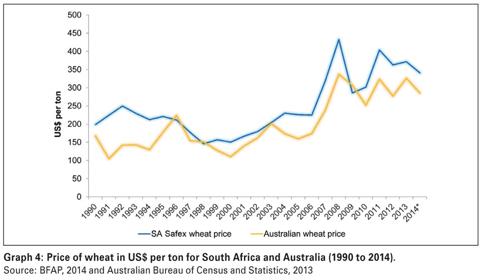
In the following section it is revealed that the gross margin per hectare for wheat grown in South Africa is higher than that of wheat grown in Australia. This is mainly because gross income for South African wheat attracts an import price that is higher than the export price for Australian wheat. The variable costs of production for South African and Australian grown wheat are very similar.
Farm-level comparisons: Measuring results from agri benchmark
Agri benchmark is an international network of agricultural experts, advisors, producers and agri businesses aiming to understand production systems, benchmark costs and who measures farm practises across the globe.
More than 30 countries currently form part of the network in order to compare and benchmark farms globally from both a financial and technical perspective. In the following section a comparison is made between wheat farms in Australia’s wheat belt and South Africa’s Overberg, Eastern Free State and Northern Cape irrigation producing regions.
Graph 5 illustrates the yield obtained on a typical farm in Australia’s western wheat belt and South Coast wheat belt producing regions compared to levels in the Overberg, Eastern Free State and Northern Cape irrigation regions.
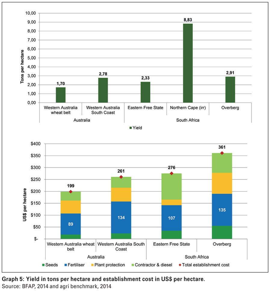
The graph further shows the establishment cost per hectare for the two countries which include the cost for seed, fertiliser, plant protection and operating costs. The results refer to the following period:
- Australia: Average for 2009 – 2013
- South Africa – Eastern Free State: Average for 2012 – 2013
- South Africa – Overberg: Average for 2008 – 2012
- South Africa – Northern Cape: Average for 2008 – 2012
Graph 5 demonstrates that from a yield perspective, South Africa performed well against Australian farms where the Overberg region had outperformed both Australian typical farms.
The Eastern Free State farm with an average yield of 2,33 tons per hectare had outperformed the Australian wheat belt farm, but not the South Coast farm that is situated in a high rainfall region and is more representative of a typical western Australian farm.
In terms of cost structures, South Africa’s establishment cost in both the Eastern Free State and Overberg was higher when compared to Australia’s US9 per hectare in the western wheat belt and US1 per hectare in the South Coast wheat belt. In particular, contractor and diesel costs on South African farms were higher.
Graph 6 represents the key technical parameters between the two countries and illustrates fertiliser and seed application rates along with nitrogen technical and economic productivity indicators.
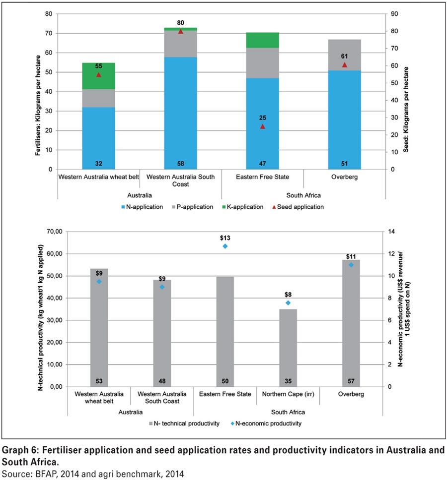
The farms in the Eastern Free State and Overberg regions applied on average between 47 to 51 kilograms of nitrogen per hectare, whereas Australian farms varied between 32 kilograms per hectare in Western Australia and 58 kilograms per hectare in the South Coast wheat belt region. Seed application rates in the South Coast region of Australia substantially exceeded South African farms.
On average, the South Coast farm applied 80 kilograms of seed per hectare. From a technical productivity perspective, South African dryland farms performed similar to Australian farms.
In the Overberg region, for every kilogram of nitrogen being applied, a total of 57 kilograms of wheat was harvested compared to 53 kilograms of Western Australia and 48 kilograms in the South Coast region. Furthermore, for every US$ spend on nitrogen on Australian farms, a total of US was obtained in revenue (wheat sold). In South Africa this indicator varied between US on irrigation farms to US in the Eastern Free State.
Graph 7 illustrates the relative competitiveness of production costs in South Africa and Australia on a per ton basis which illustrates the establishment costs to produce one ton of wheat.
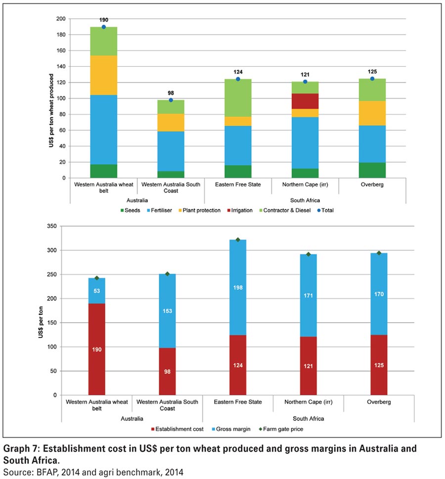
Yield is therefore integrated in the comparison. In a global environment, it is essential to know who can produce a crop the most cost effectively and efficiently. The second graph illustrates the gross margin levels on a per ton basis, where the red bars show the establishment cost and the blue bars, the gross margin per ton.
From Graph 7 it is evident that South African farms can compete against Australian farms as seen from a cost perspective. On average, it will cost an Eastern Free State or Overberg producer about US5 to produce one ton of wheat where in the South Coast it will cost a producer US per ton. The lower yield levels on the Western Australian wheat belt farm caused the per ton cost to increase significantly.
Furthermore, South African gross margin levels have exceeded Australian wheat farms, driven by higher output prices due to the import parity status of South African wheat. On average, gross margin levels in South Africa varied between US8 in the Eastern Free State to US0 in the Northern Cape irrigation region and the Overberg.
Although wheat grown in South Africa enjoys a higher gross margin than that produced in Australia, the extra benefit is not large enough to offset the large comparative advantage that Australian producers receive in having huge economies in size of production compared with those of South African wheat producers.
In Australia, according to the Australian Bureau of Agricultural and Resource Economics (ABARE), in 2011 the average area of wheat per producer grown by 29,786 Australian producers, was 453 hectares.
The area of wheat grown in the same year by 3,925 South African producers averaged 154 hectares per producer (DAFF, 2011). This shows that the Australian producers grew almost three times the number of hectares of wheat than the South African producers.
On those hectares each Australian grower produced on average 1,005 tons of wheat which was twice or 100% greater than the amount of 505 tons produced by each South African producer. Australian producers were more profitable because they were able to spread their overhead costs over a much larger number of units of output.
Conclusions
The analysis provided an illustration that South African wheat producers are not that bad off when compared to a major wheat producing country such as Australia. In some instances, South African producers outperformed Australian producers with specific reference to market prices, yield levels and hence, profitability.
Thus, from the analysis one could ask the question why the area has declined substantially when local producers can compete against major global players such as Australia. This is due to a number of reasons. The long-term reduction in areas sown to wheat in South Africa was due to reductions in plantings by dryland producers in the summer rainfall region.
This is primarily due to a lower number of hectares being sown to wheat over time by producers in the Free State. Climatic conditions and more favourable returns in crops such as maize and soybeans in the Free State mitigated strongly against wheat production.
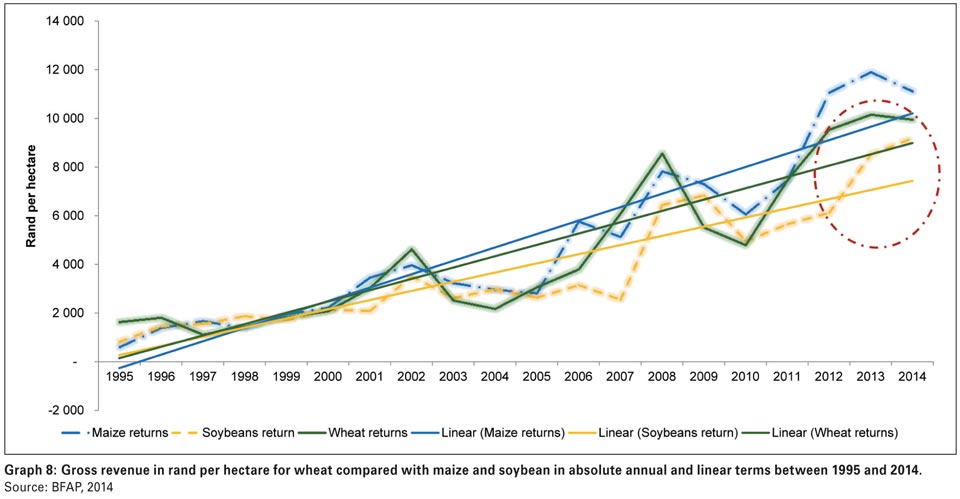
Graph 8 proves that the gross returns (price multiplied by yield) for maize and more recently soybeans have outpaced wheat, making the former more favourable crops to cultivate.
The comparison of the South African wheat producer compared with the Australian grower revealed that the latter continued to grow wheat and actually increased the area sown because they enjoyed large economies of size.
For example, in 2011, Australian producers had a comparative advantage over South African producers.
In that year, each Australian wheat producer grew twice as much or a 100% greater volume of wheat than that produced by each South African producer. This comparative advantage has continued to the present. It has led to them being more profitable because on average, each grower was able to spread their overhead costs over a much larger tonnage of output.
References
Australian Bureau of Agriculture and Resources (2011). Farm sizes and number of wheat producers in Australia; Government of Australia, Canberra, Australia.
Australian Bureau of Agriculture and Resources and Sciences (2014). Agricultural commodities; Australian Government Department of Agriculture, Canberra, Australia.
Department of Agriculture, Forestry and Fisheries (2012). Wheat market value chain profile; Pretoria, South Africa.
Department of Agriculture, Forestry and Fisheries (2013). Trends in the agricultural sector; Pretoria, South Africa.
Publication: February 2015
Section: Relevant


